
Testing One Onboarding Flow Across Three AI Tools

I gave the same mobile onboarding prompt to UXPilot, Stitch, and Figma Make to explore how each tool would interpret the same UX challenge. I reviewed the generated screens based on flow completeness, interaction logic, error recovery, clarity, visual consistency, usability, and the amount of manual refinement required.
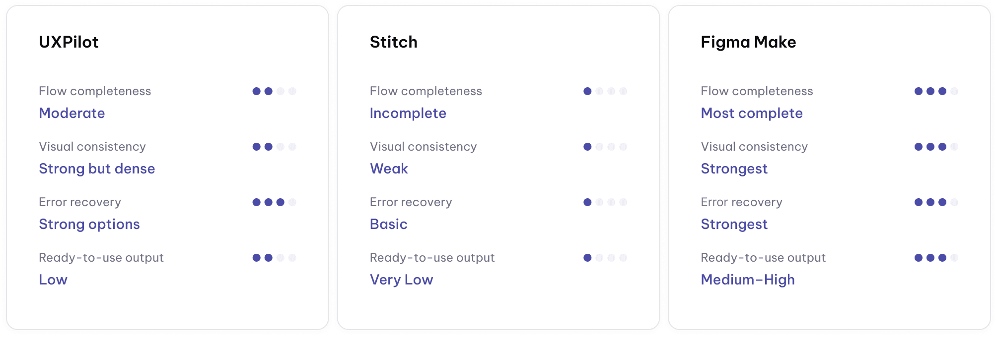
Tools Results
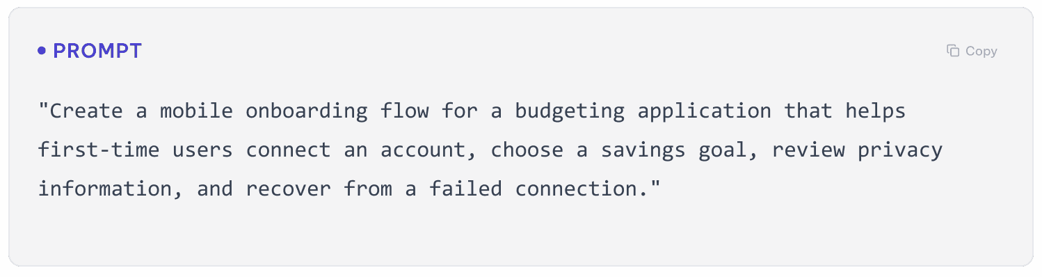
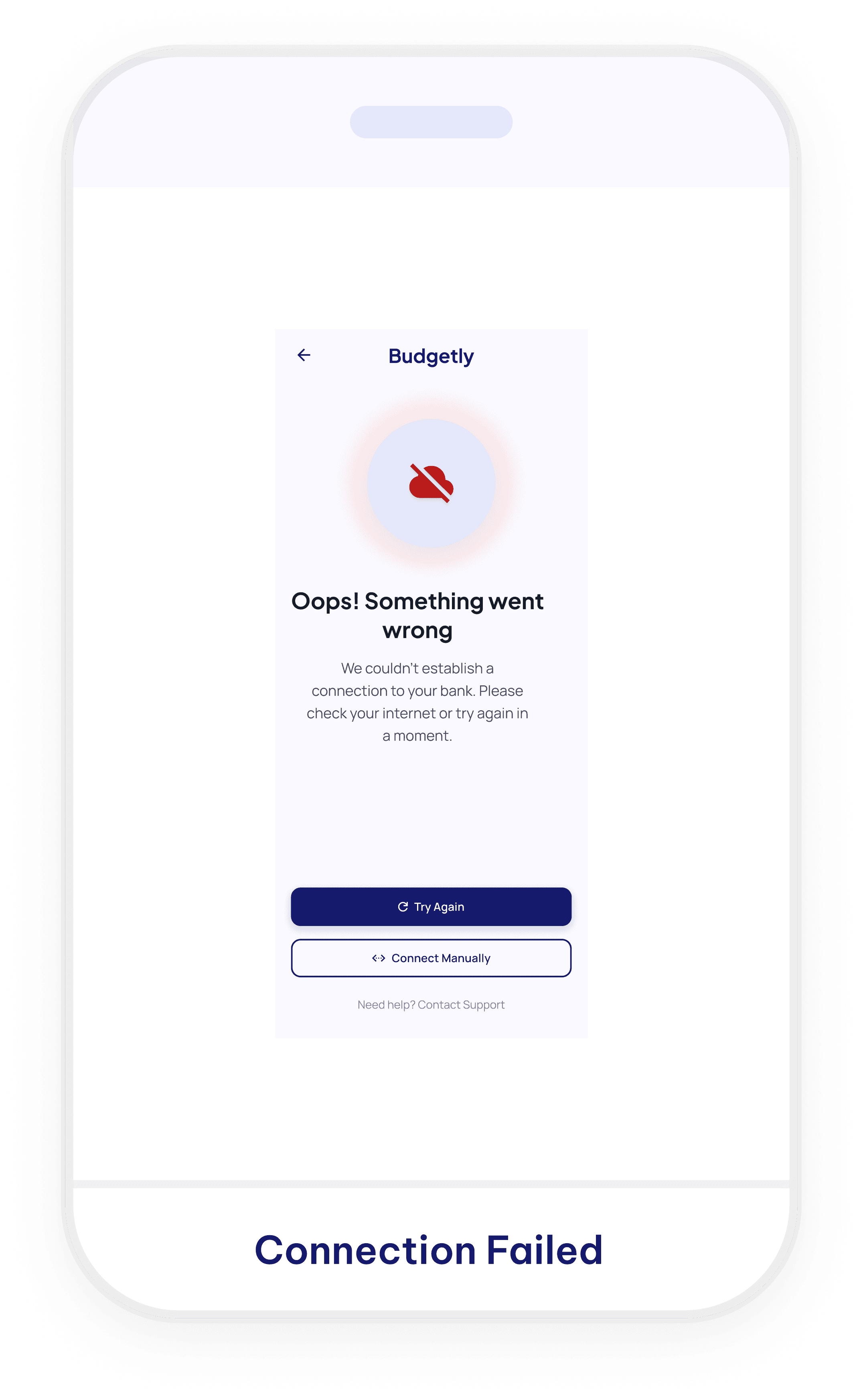
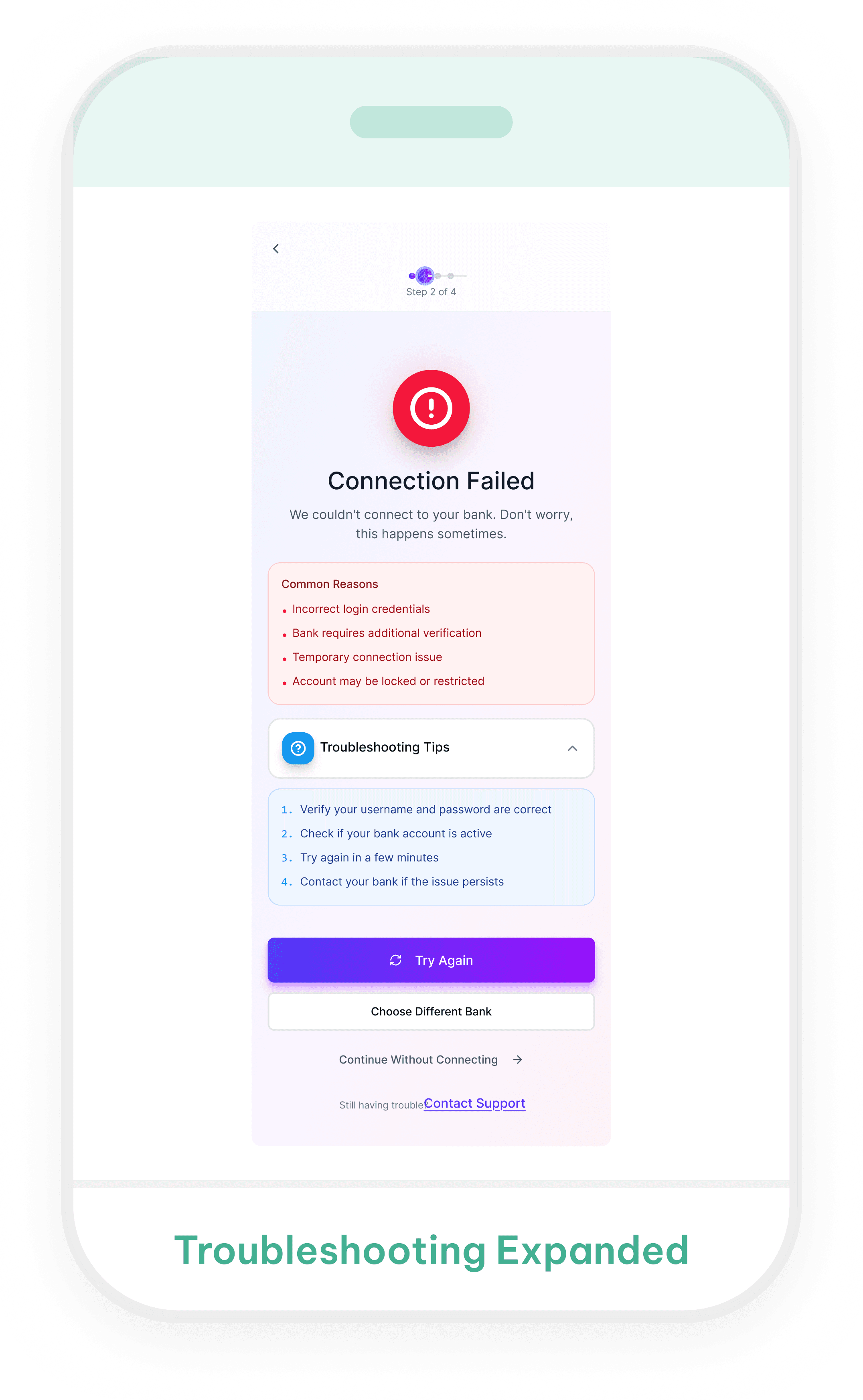
UXPilot


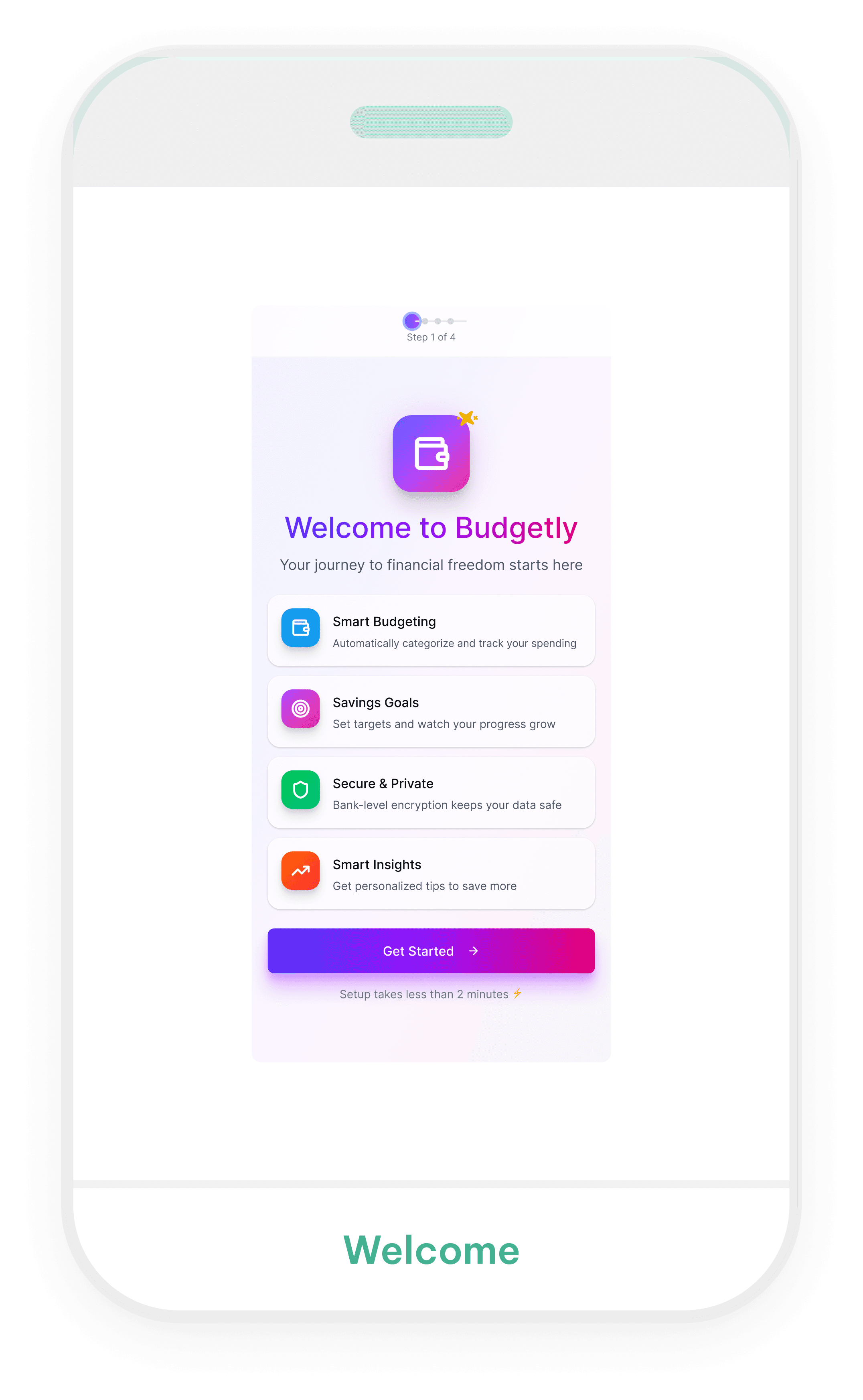
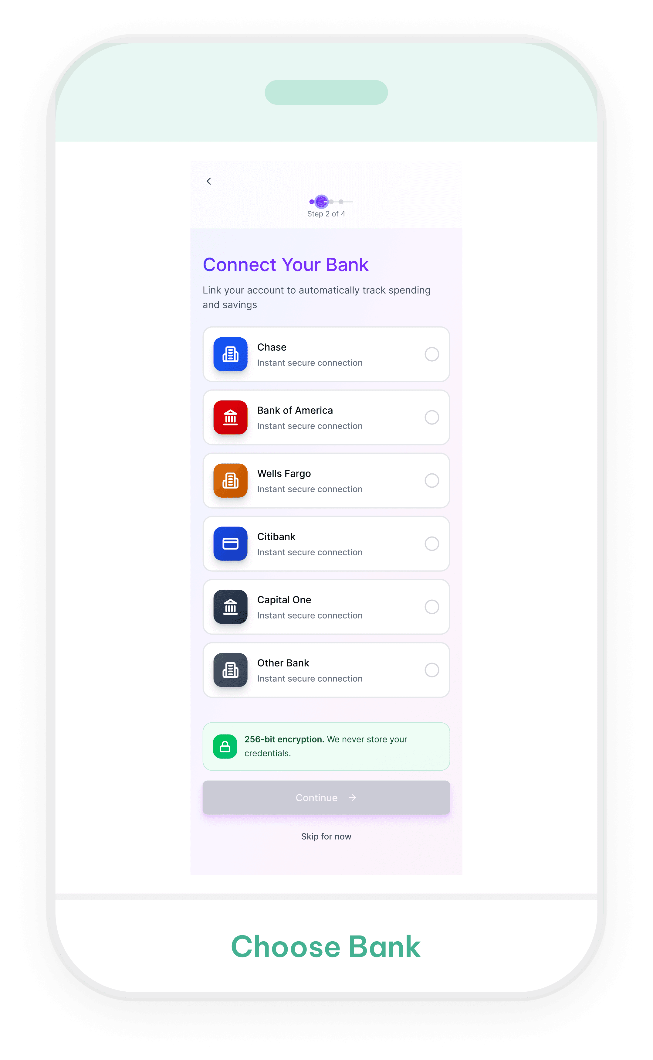
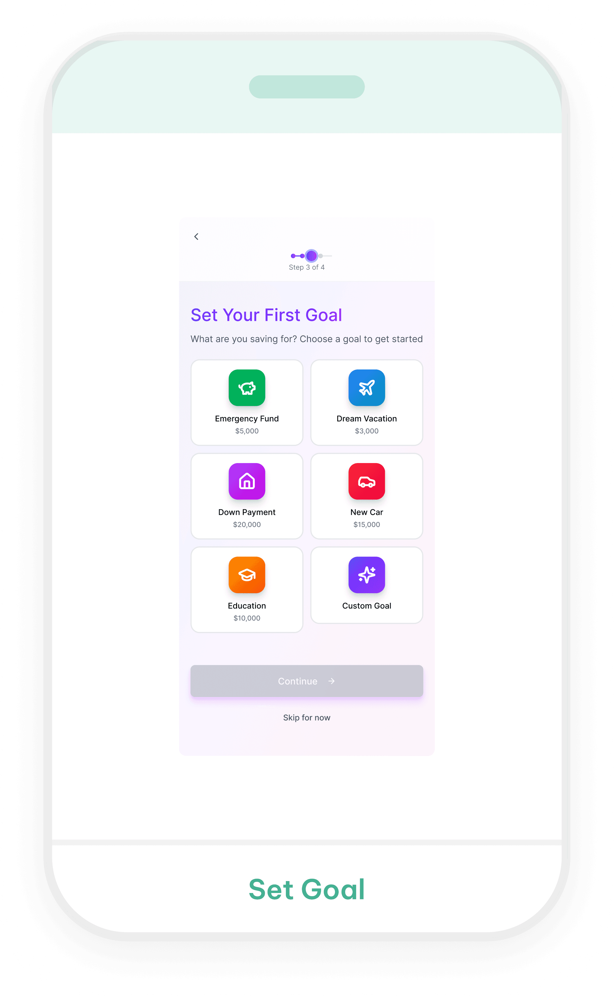
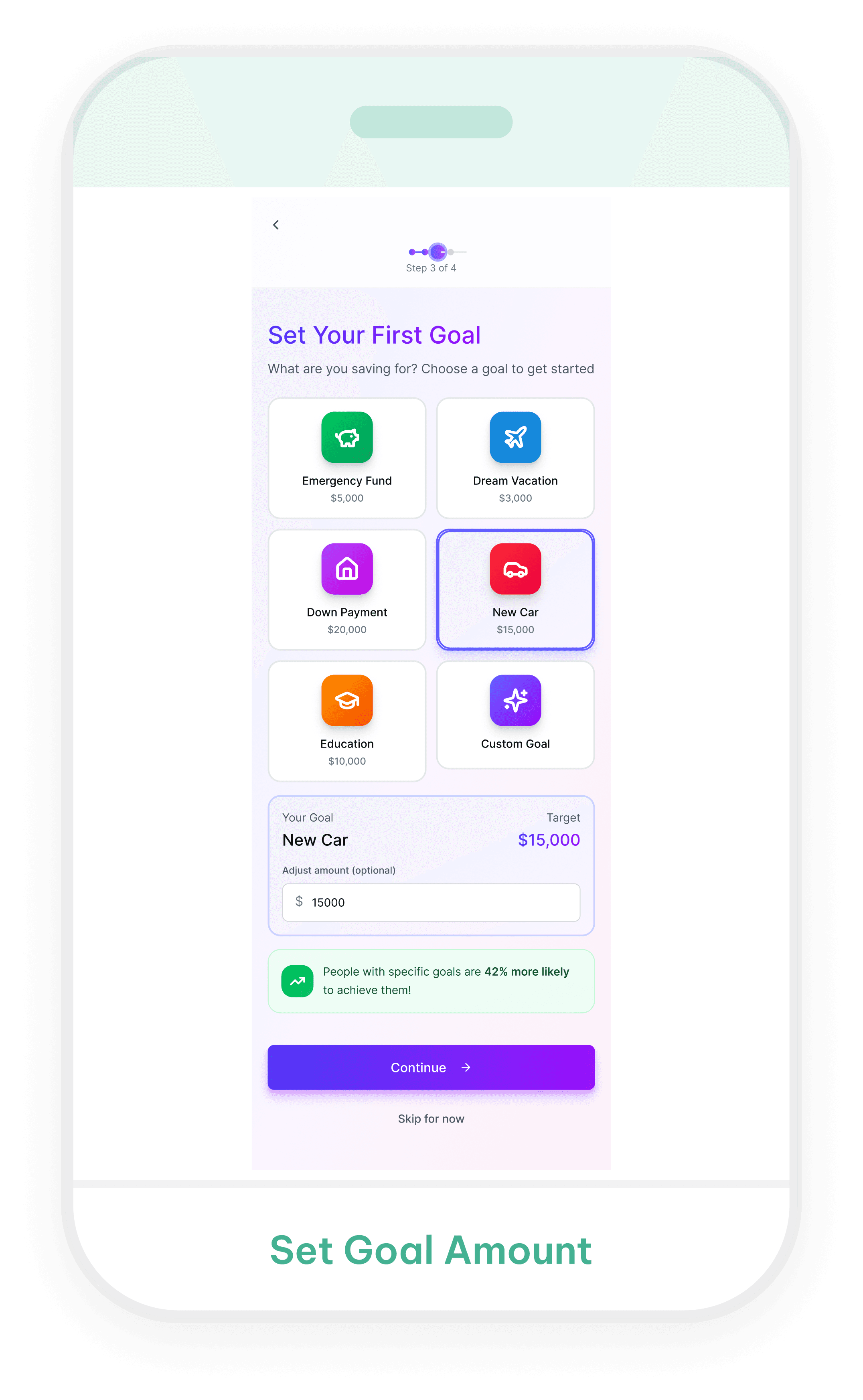
Stitch
Takeaway
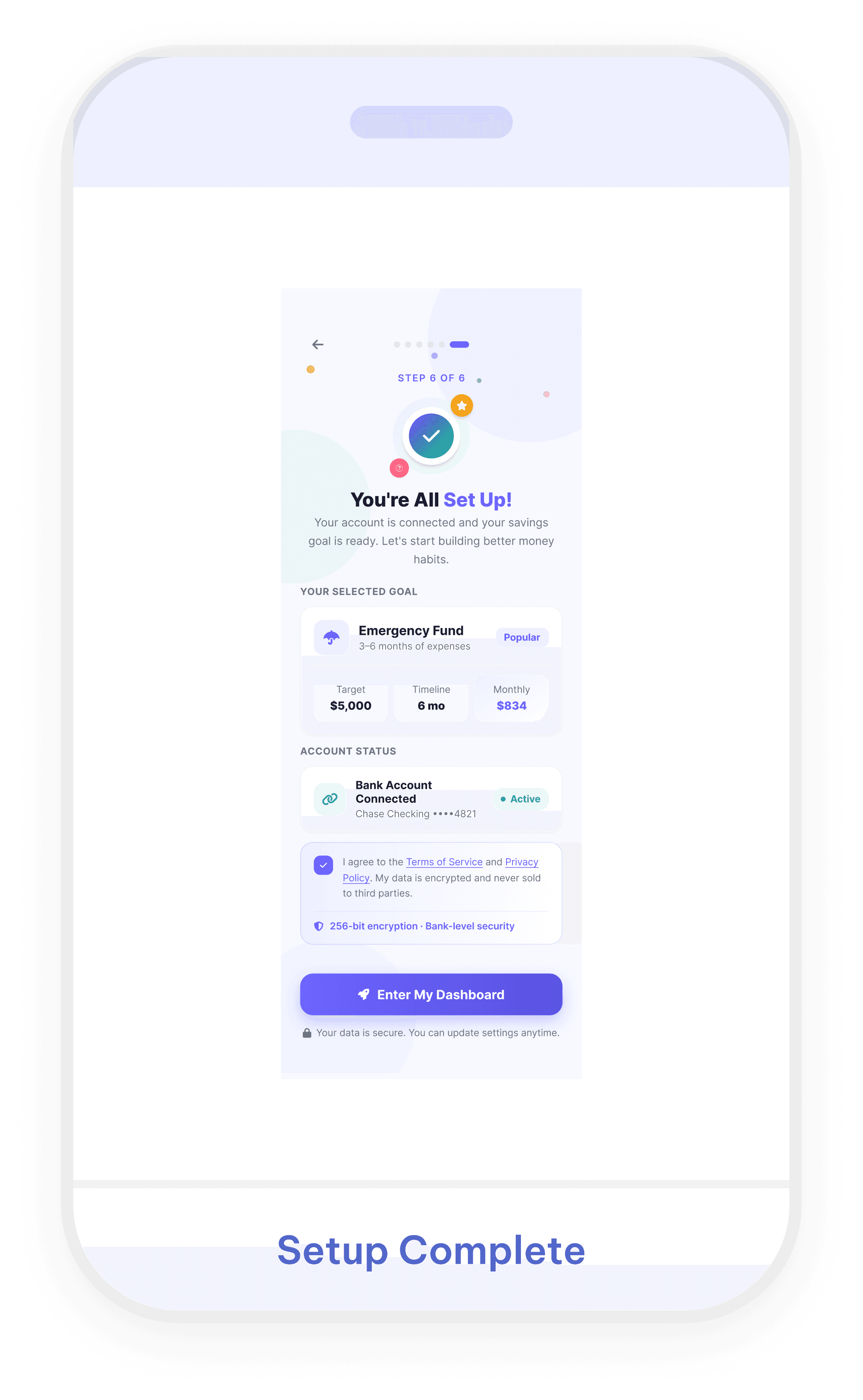
Polished visually, but required major refinement to simplify the experience and correct the flow logic.
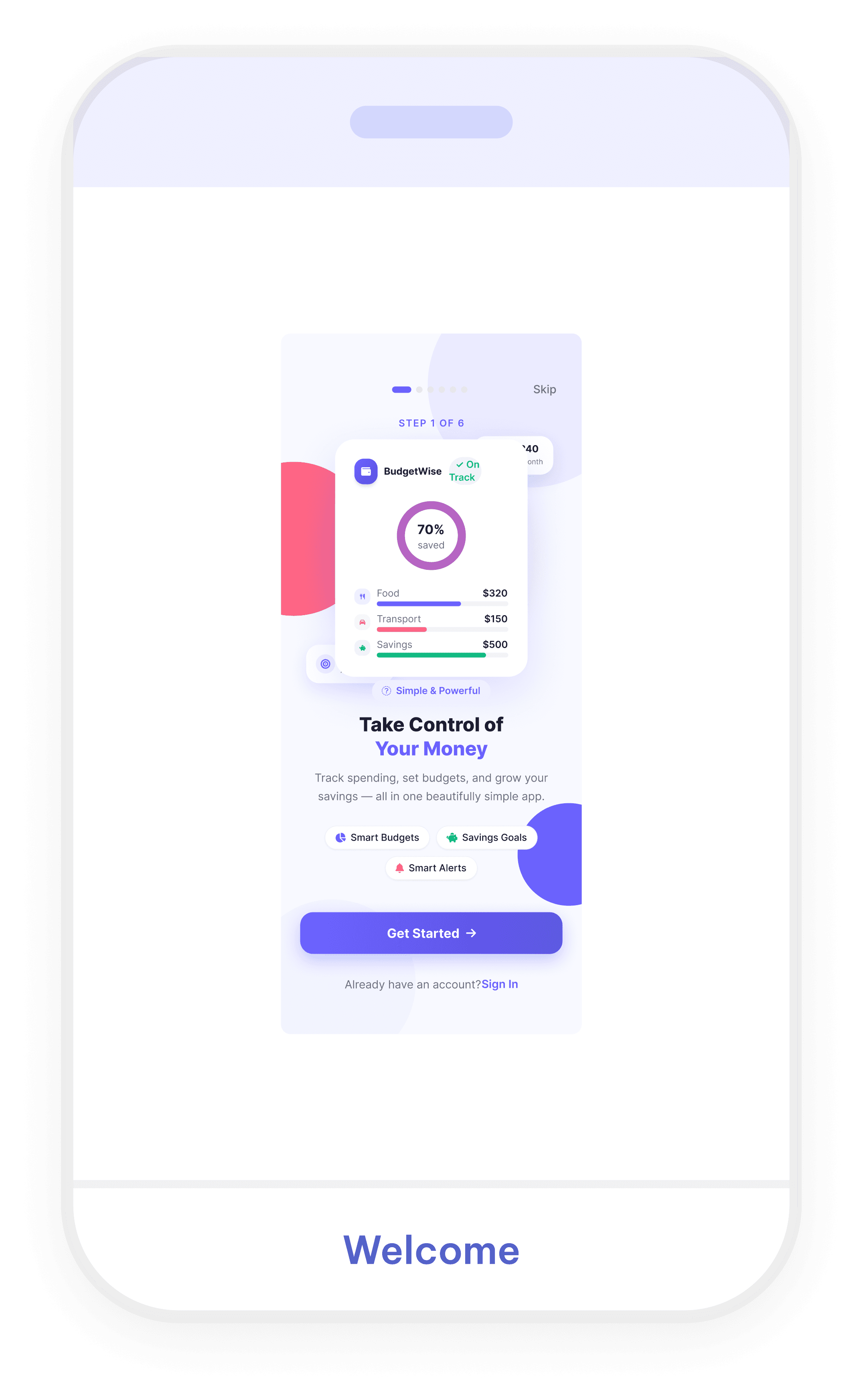
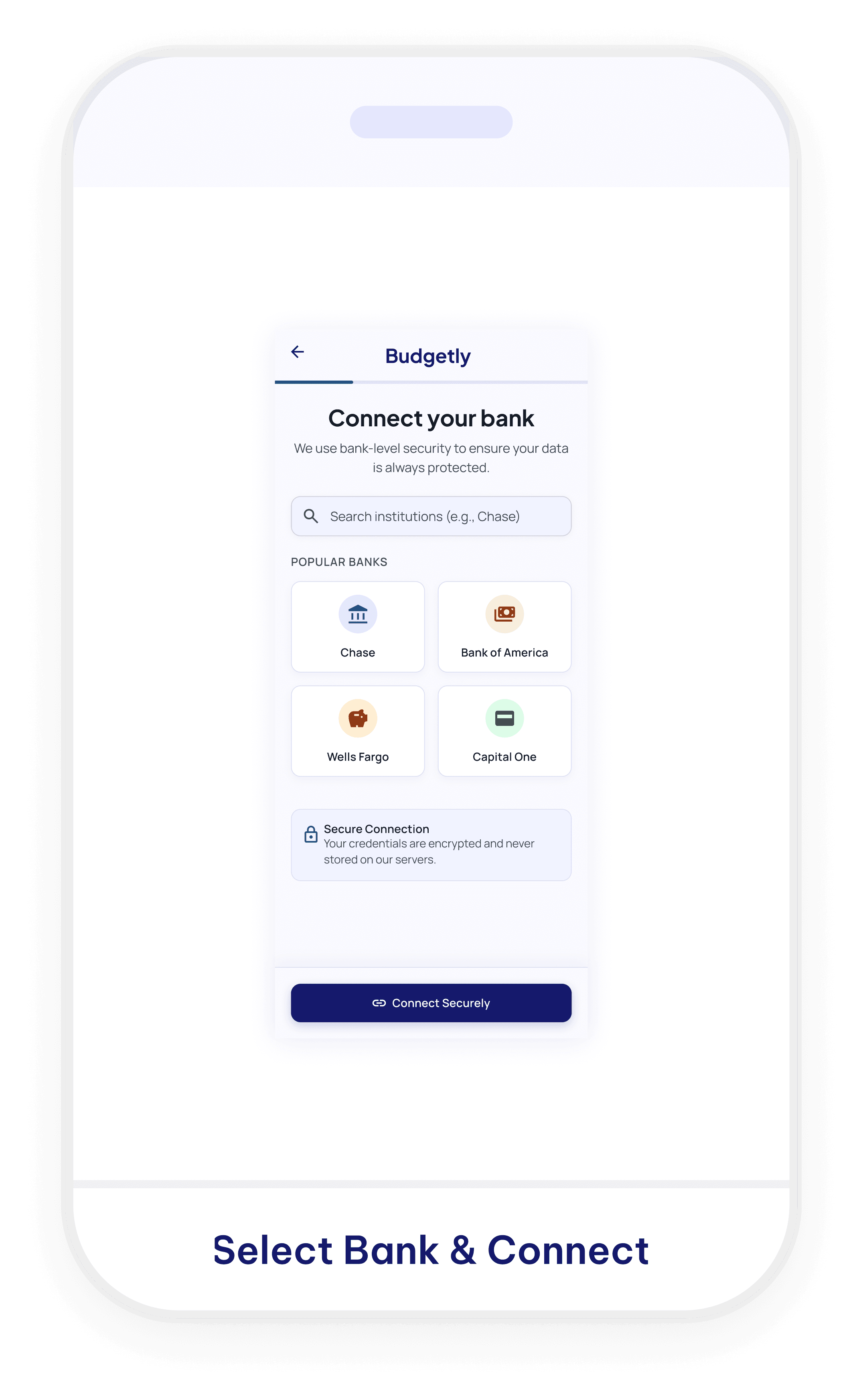
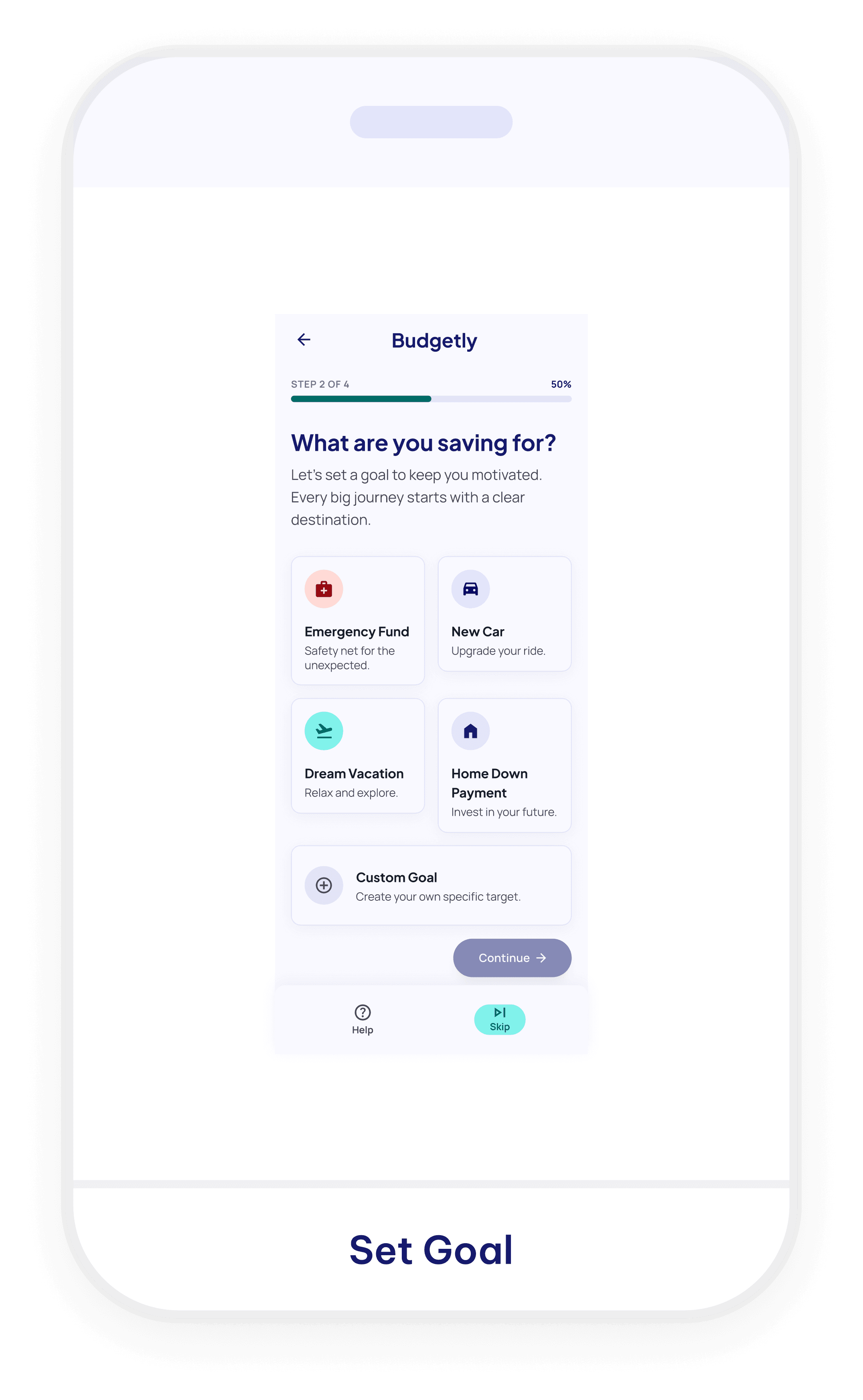
Stitch


Stitch
Takeaway
Clear in parts, but the screens did not feel like one consistent or complete onboarding experience.
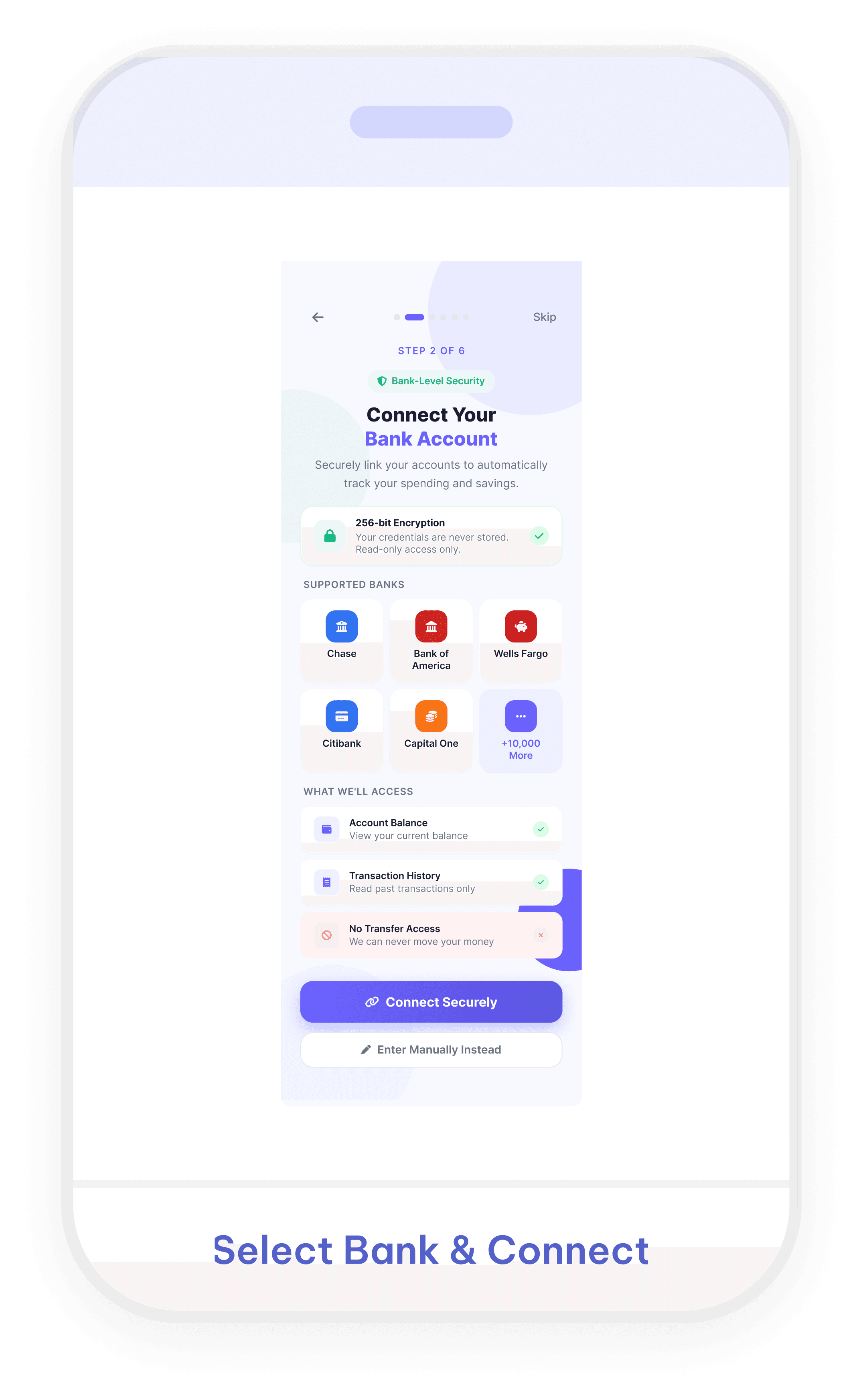
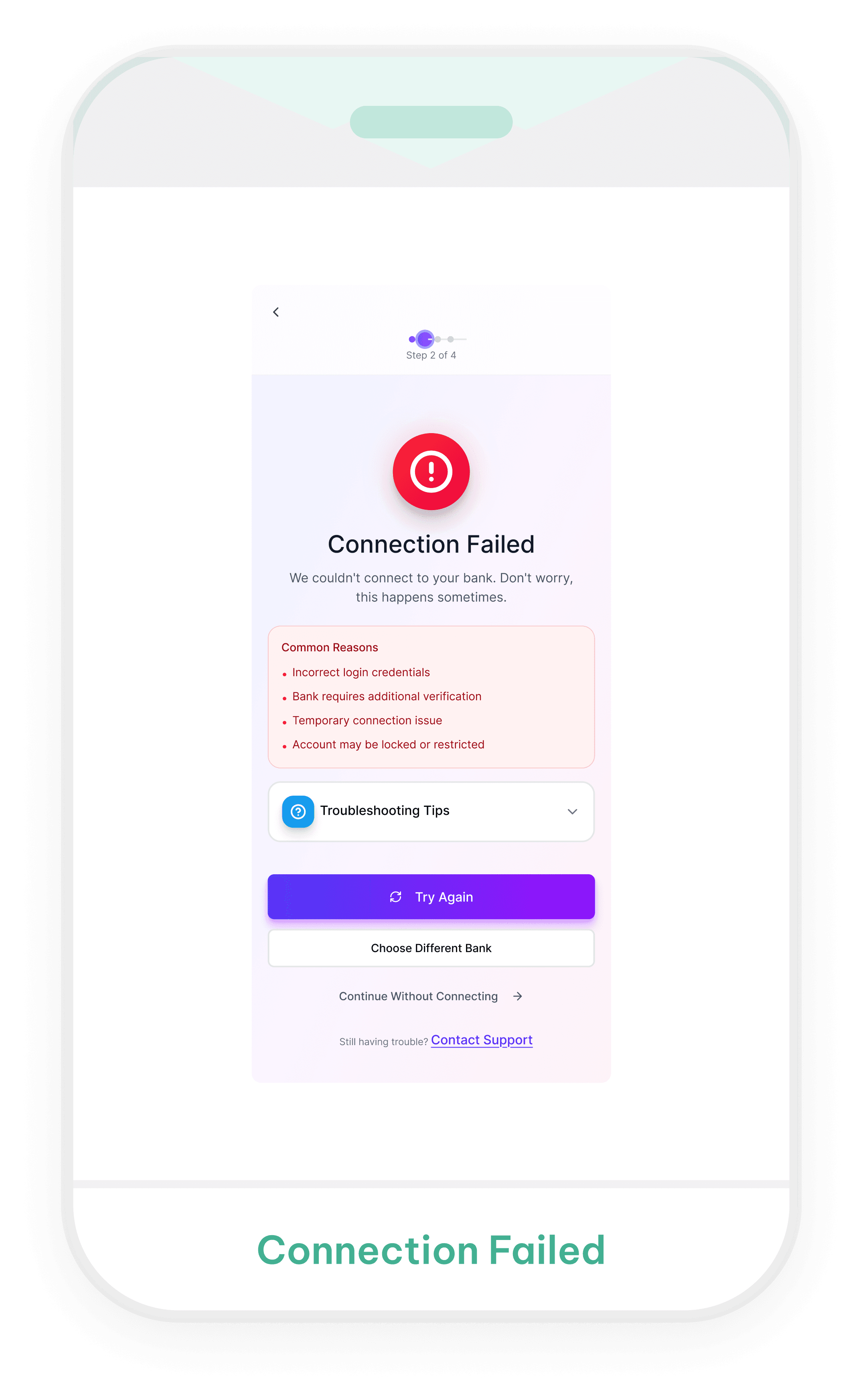
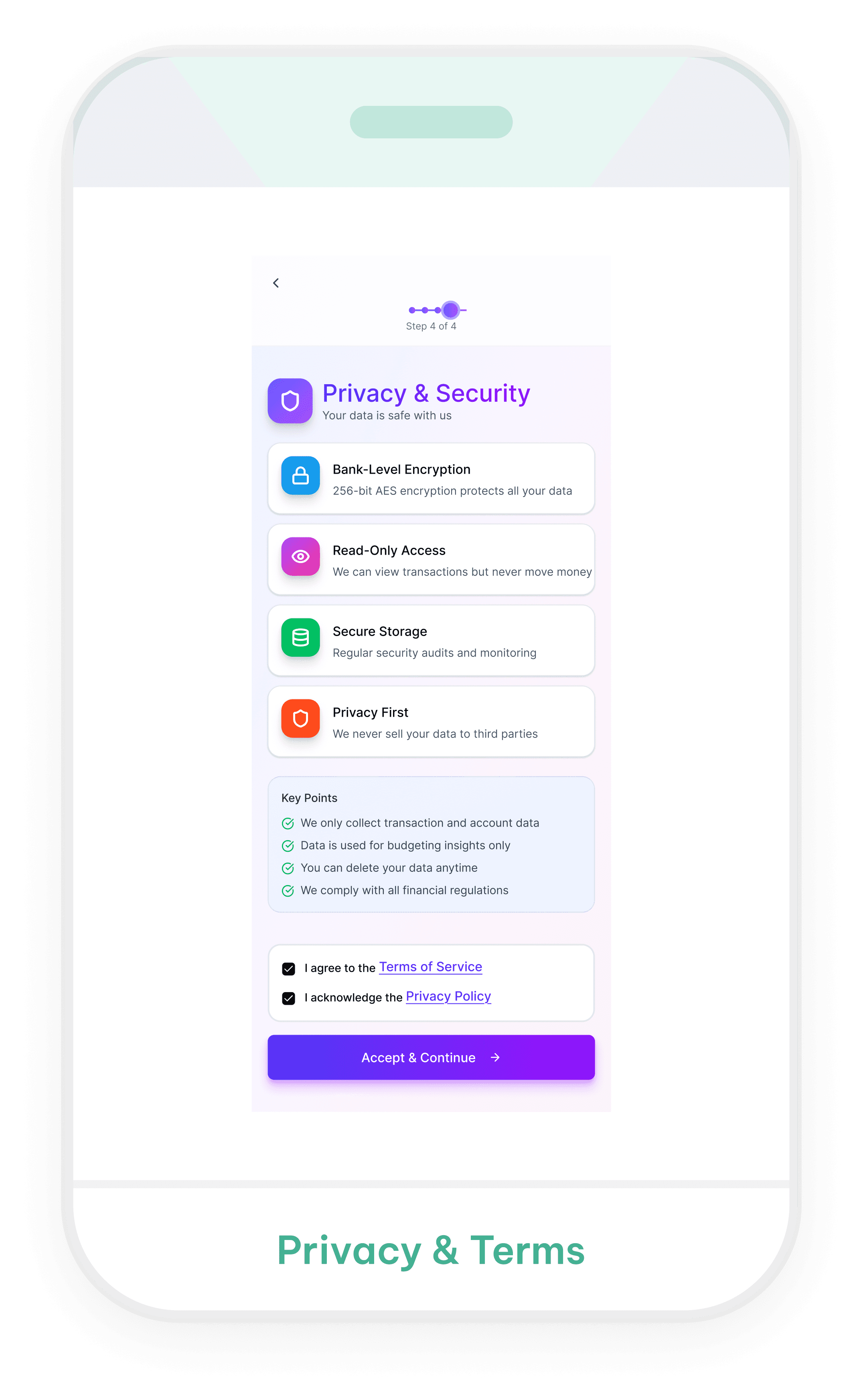
Figma Make


Figma Make
Takeaway
Experiment Overview
Comparison
Key findings

Reflection
This experiment showed me that the same prompt can produce very different interpretations depending on the AI tool. UXPilot emphasized visual detail, Stitch produced simpler but less consistent screens, and Figma Make created the most
complete interaction states.
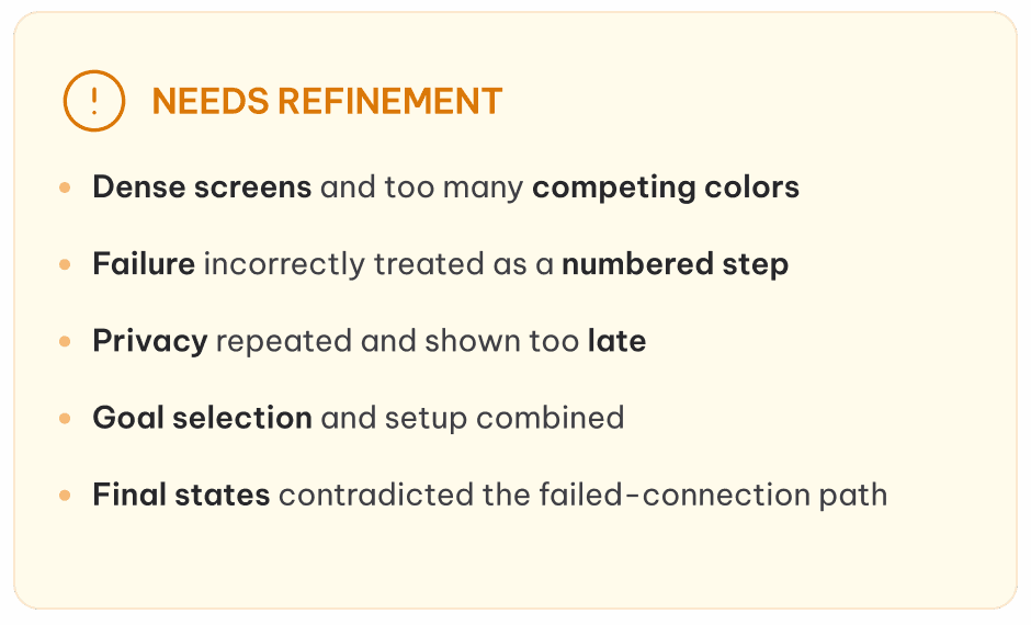
However, none of the outputs were ready to use without refinement. I still needed to evaluate whether the steps were necessary and correctly ordered, whether failure states were treated as conditional branches, when privacy information should appear, how users could recover or skip, and whether the completion state reflected the path they actually followed.
My main takeaway is that AI can speed up exploration and help generate possible directions, but it does not replace UX judgment. The designer is still responsible for simplifying the experience, validating content, identifying missing states, and turning generated screens into a coherent and trustworthy user journey.